Create a free profile to get unlimited access to exclusive videos, sweepstakes, and more!
Revision to temperature measurements doesn't change global warming

 There's a bit of climate news I want to clarify before the usual suspects start misleading people about it.
There are three big global temperature records used by climatologists. One is called HadCRUT (Hadley Centre and the Climatic Research Unit Temperatures), and was recently revised by scientists at Hadley. This newly-revised database, called HadCRUT4, uses better measurements of land air temperatures and sea-surface temperatures than before. In the former case, more measuring stations have been added (giving better coverage) and have been standardized better. In the latter case, the revised database accounts better for measurement uncertainties from things like the method used to collect water (including, of all things, how the buckets used to scoop up water alter the temperature of the water collected).
The two most important things that have come out of this new database: 1) the Earth is still warming up, and at the same rate as has been determined before, and 2) (according to a BBC report) 1998 is no longer the warmest year on record. 2010 is.
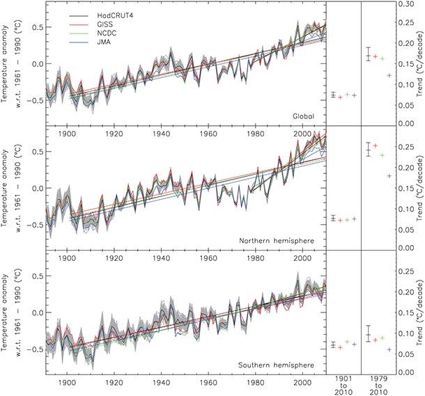
Here's the key plot (from the journal paper describing the database revision):

The new HadCRUT4 data is black. I know, it's a bit hard to read, but the major points to note are that all the measurements follow each other -- indicating consistency and accuracy in the measurements -- and all show a sharp rise in northern hemisphere temperatures (the middle plot) from about 1970 to today.
Just to make sure there's no misunderstanding, this is not a plot of temperature directly. The scientists took the temperatures from 1961 to 1990 and got the average. They then subtract that from the actual measurements to get a deviation from average (this is called the "temperature anomaly"). So, for example, if the line were flat and had a value of 0 to the right of 1990, that would mean the temperatures have not changed since 1990. If it were flat at 0.2, that would mean the temperature has increased to 0.2° above average and stayed there.
But what we really see is a line with a positive slope, which means that temperatures have increased and have continued to increase.
That's bad. That's global warming. It is this very simple graph that so many people are loudly and desperately trying to deny. The thing is, all they can make is noise. The data are pretty clear.
Now about that "hottest year" thing, where 2010 is now the hottest year and 1998 places third... I've covered this before. Nine of the ten hottest years have been since the year 2000. But as I've also pointed out before, these record-breakers are not much use on their own. It's the overall trend that counts. The difference in temperatures between individual years is pretty small, so a minor change might swap two years in the standings (like how 1934 became hotter than 1998, but only by a couple of hundredths of a degree, a tiny amount). But that's not the point: the point is that of all the hottest years on the record, most of them were in the past decade or so!
In other words, the planet is warming up. Now.
But we knew that. In every way we can measure it, the planet on which we live is changing, and changing more rapidly now in the past few years.
Related Posts:
- While temperatures rise, denialists reach lower (and a followup with me destroying an amazingly bad rebuttal of my points) - New independent climate study confirms global warming is real
- Is it hot in here, or is it just me?
- 2011: The 9th hottest year on record
- New study clinches it: the Earth is warming up
- Climate change: the evidence
- NASA talks global warming


