Create a free profile to get unlimited access to exclusive videos, sweepstakes, and more!
The future history of the Sun
New data shows when the Sun will start to die.

Imagine you knew nothing of the human species. I hand you a photo of a child, say 8 years old. What can you say about that child’s future, biologically?
Not much. You can maybe measure their height, look at their skin and hair color and shape, the lengths of fingers and arms and such… basically make physical measurements and observations but there’s not much of a conclusion you can draw about their future. You lack knowledge of their past and importantly their context; you’ve only seen this one child, and the image only shows a moment, a tiny fraction of their lifespan.
We have the same issue with the Sun. We’ve been observing the Sun for centuries, but this too is only a sliver of its existence, a thin slice showing what it’s like now.
What of its future?
There’s a way to figure that out. Going back to our first allegory, now imagine I show you a database with hundreds of millions of peoples’ photos in it, in toto ranging across the human lifespan. Not only that, you also have their age. What can you glean now?
Ah, you can look for children that have similar characteristics as the one you saw first, then maybe look for a cohort with similar features but a little bit older. Then you can extrapolate forwards from there, and backwards, and start to get an idea of what a human looks like from birth to death.
You may see where I’m going here. This is true for the Sun as well, and it’s something astronomers have done before. Telescopic observations have recorded characteristics for millions and millions of stars, and by looking at ones with similar characteristics as the Sun we can start to get an idea of how stars like the Sun behave in general. We also have ways of getting ages of stars — looking at their chemical composition, their size, and more — which allows us in principle to trace the Sun’s life history. Even its future.
And while this has been done before, it’s never been done before with Gaia’s newest dataset. ESA’s Gaia has been observing the heavens for nearly a decade now, measuring the positions, motions, distances, spectra, and colors of over a billion stars. Yes, billion with a b.
It’s a vast database, and the nearly equally huge team of astronomers working on Gaia used to it look for stars like the Sun to extrapolate the Sun’s behavior [link to paper; see section 7 in particular]. “Like the Sun” is a bit fuzzy, but they went through the immense catalog and looked for stars within 100°C of the Sun’s temperature, as well as ones with very similar gravity, radius, and various other specs. Given the fine data quality they demanded — basically, that the stars be bright enough to measure all this carefully — they found 5,863 solar analog stars.
OK, great. So what to do with this data?
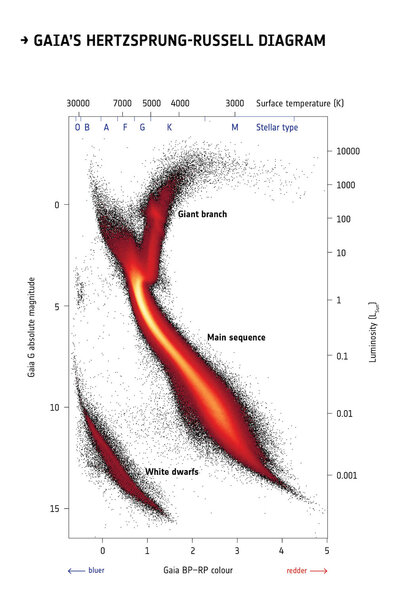
They made an H-R Diagram! A Hertzsprung-Russell Diagram, that is, which plots various characteristics of a star versus some other characteristic. A common one, for example, is to plot the stars’ luminosities — how much energy they give off — versus their temperatures (similar to this is what astronomer call their absolute magnitudes versus their colors, which in effect measure their luminosities and temperatures). When this happens stars fall into various patterns which tell you where they are in their lives: Stars like the Sun which are merrily fusing hydrogen into helium in their cores fall along a broad swath of the graph we call the main sequence. Dying red giant stars are more luminous but cooler, and they are on a track to the upper right. Already dead white dwarfs are hot but faint, so they’re down in the lower left.
It’s not an exaggeration to call this the most important graph in astronomical history. It allowed us to understand the stars.
I describe this in more detail in Crash Course Astronomy: Stars. The good part starts around 5:30, but you might want to watch the whole thing to get a good feel for this.
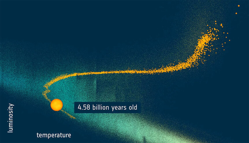
Once they had this gigantic HR Diagram in hand, the astronomers then looked at just what the Sun-like stars were doing, extrapolating to the known changes such a star goes through in its life. Then, using their ages determined from the spectra, they could make an animation showing the once and future Sun:
To be honest, this is more or less what we already knew, but a lot of these data are better than we’ve ever had before, so the numbers can be found to higher accuracy. For example, for the next few billion years the Sun will get hotter (moving left in the graph) and brighter (moving up). But when the Sun gets to about 9 billion years old that changes: When it starts to run out of hydrogen in its core to fuse into helium it’ll rapidly expand, cool, and get brighter (moving to the right and upward), turning into a red giant.
There are a lot of details skipped in that video — for example the Sun will expand a little at first and become a subgiant before becoming a true giant, and will go through several phases where it expands and contracts as its core goes through complicated phases of contraction and expansion. If you want details, boy howdy do I give them in my book Death from the Skies!, in Chapter 7, “The Death of the Sun.”
With the Gaia measurements giving better numbers to this, as well as IDing a lot of Sun-like stars for follow-up observations, we may get even more details on what to expect over the next few billion years of the Sun’s life, if you don’t have the patience to wait. That’s the brilliance of a general survey mission like Gaia, one that gets a ton of info about a lot of objects: You don’t necessarily know what you can do with the data until you get them, but once you do, well.
The sky’s the limit.