Create a free profile to get unlimited access to exclusive videos, sweepstakes, and more!
Battle of the Checkerboard Bulge

I love optical illusions, especially ones where you know what your eyes are telling your brain is wrong, but you can’t seem to get your brain to see that.
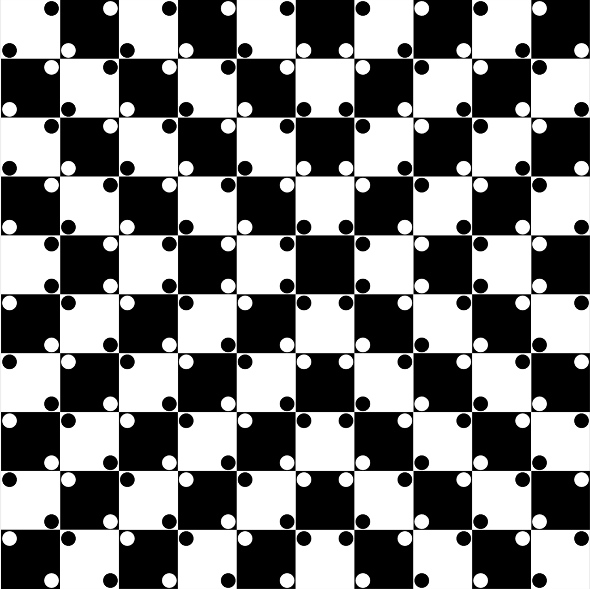
The famous Checkerboard Illusion is a great example of this. Look at it: You know it’s an illusion, and you just know those squares are straight—their borderlines all parallel and perpendicular—but you can’t get your dumb brain to ignore your lying eyes.
Cory Albrecht made a great page for this, with a slider bar that shows you the board with and without the dots, so that you can see for yourself the lines are all straight. Even then, the board looks all bulgy. Amazing.
The illusion itself is attributed to Akiyoshi Kitaoka (the creator of what I consider the single greatest illusion of all time), but what causes it?
Sebastiaan Mathôt, writing at the CogSci website, talks about the margins, the distance between the dots and the edges of the similarly-colored squares.* The dots don’t actually touch the border; they’re inset a bit, leaving a margin. He speculates our brains interpret these margins as lines, skewing our perception, changing the apparent angle of intersection of the square borders. Instead of all right angles, some apparently becoming acute, some obtuse.
Certainly the arrangement of the dots is crucial. At the center the squares seem to bulge outward, and it has two black dots flanking each of its four its vertices. But closer to the edge the lines look slanted, and the dots are arranged differently (black squares have a pair of white dots in opposite corners, and vice-versa). On the left is a 3x3 crop of the upper right part of the board; see how the vertical lines appear to slant left? (It may help to look a bit to the side of the picture to see it, oddly.) The dots are arranged differently there.
This may be a variation of the Hering Illusion, where parallel lines are distorted when placed over lines radiating from a point. If so, it could have something to do with how we perceive distances, since the Hering Illusion relies on perspective based on the vanishing point. Interestingly, this means it could be related to the Moon Illusion, where the Moon looks bigger on the horizon than overhead! It also relies on our brain getting confused about distance.
Obviously, using Albrecht’s slider, you can see the dots are important. But the margins? I’m not sure. I thought of a way to test this: The margins are very thin, thinner than the dots themselves. If I move away from the monitor, at some point I’ll get far enough away that my eyes won’t see the thin margins any more, but I’ll still see the dots. If the illusion vanishes (I see the squares being square) then the margins are important. If not, then it may be due to the dots themselves.
I shrank the image down to make the distances manageable and tried it out. To my surprise, the illusion persisted even when I couldn’t see the margins (about a meter or so away from my monitor). I could still see the dots though.
Hmmm. I backed up farther. At about two meters away the dots blurred too much for me to see them against the squares … and the illusion vanished. This makes me think it’s the dots themselves governing this illusion. Try it!
I think it might have more to do with our brains trying to connect the oppositely colored dots themselves, and getting tricked by the dots around them. But, to be honest, I can’t be sure.
Interestingly, when I shrank the image down the illusion got far stronger! I placed the shrunken version here; to me, the lines appear far more curved, and I had to hold up a straightedge to them to convince myself the image processing routine I was using (Gimp) didn’t distort the field. Test it for yourself: The lines are still straight. Incredible.
But why? I’m not sure. I suspect it has to do with more of the smaller squares fitting into your central field of view; some illusions depend on where in your field of view things happen. That would be consistent with the idea that when you look at a small section of the board, it’s the surrounding dots that warp the lines. You can see them more easily in the smaller version.
In the end, I don’t think a lot is understood about the specifics of this illusion. That in itself is pretty cool! That means there’s more to learn.
And in the end, this illusion shows us something I’ve said over and over on this blog: Seeing should not be believing! What you see is never really what’s going on; there are a whole series of things going on between your eyes and your brain that distort reality.
How many times have you heard someone say, “I know what I saw”? I always smile ruefully when I hear that. They think they know what they saw. But what may have really happened may be far, far different.
Tip o’ the Necker cube to Cory Albrecht.
*Correction, Jan. 8, 2015: This post originally misspelled the first name of researcher Sebastiaan Mathôt.


