Create a free profile to get unlimited access to exclusive videos, sweepstakes, and more!
Cloudy Earth
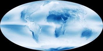
I’ve seen a lot of images of our fair blue world, but this one is unique and (somewhat more than metaphorically) breath-taking: a map of Earth showing its average cloudiness.
That gorgeous picture was made using data from the Aqua satellite, which observes the Earth to measure its water cycle. That includes keeping an eye on air moisture, precipitation, ice (both on land and sea), snow, and, obviously, clouds.
This image was made by taking more than a decade’s worth of observations—from July 2002 to April 2015—and getting the average value for the cloud cover at each location on the planet. These were then translated into colors: dark blue for no cloud cover, white for cloudy all the time, and shades of blue in between.
A lot jumps out even at a glance. The Sahara and Middle East are obvious dry spots, as is Australia and western Chile. But note Antarctica: A lot of people don’t know just how dry it is there along its interior. It’s not even completely ice covered; there are dry valleys there with no snow on them at all.
What struck me most is the wet/dry band west of South America along the Equator, as well as the obvious cloudy bands across high latitudes in the north and south. These betray large-scale circulation patterns in the atmosphere. Moist cool air from low-latitudes (again, both north and south) flow toward the equator, where they warm and rise, forming clouds. At the higher latitudes, clouds form at the boundary of polar air circulation regions.
Note that deserts are common too around ±30° latitude; air descends there, inhibiting cloud formation, encouraging desertification.
The sharp band in the Pacific is due to ocean circulation patterns redistributing heat in the water. This pattern changes on different time scales; one is over a few years and is called the El Niño Southern Oscillation, or ENSO, and the other on a decadal scale and is the Pacific Decadal Oscillation, or PDO. These affect climate all over the planet.
Speaking of which, one other thing that you can see from this map is how interconnected our planet’s clouds are. What happens at one latitude can profoundly affect what happens at another. The ENSO can mean the difference between drought and flooding for locations scattered across Earth.
There is no such thing as an isolated location.
NASA’s fleet of Earth-observing satellites gives us critical coverage of the various natural forces shaping the environment of the entire world, information we desperately need to understand our own effect. And our effect is profound.
Despite this, there are forces at work trying to shape our policy of science, twisting it to their own mad vision. They would have us stop building satellites like Aqua, stop investigating our planet. Their reasons seem obvious, but knowing that doesn’t stop them.
What will stop them is for the public to understand better just what science does, and just what scientists think. Ninety-seven percent of climate scientists agree that global warming is real, and humans are responsible.
Look again at that beautiful cloud map. That’s home, and the only one we’ll have for quite some time. The more we know about it, the more we understand its behavior, the better.

