Create a free profile to get unlimited access to exclusive videos, sweepstakes, and more!
Inside House of X, Powers of X, and graphics that are reshaping the Mutant world
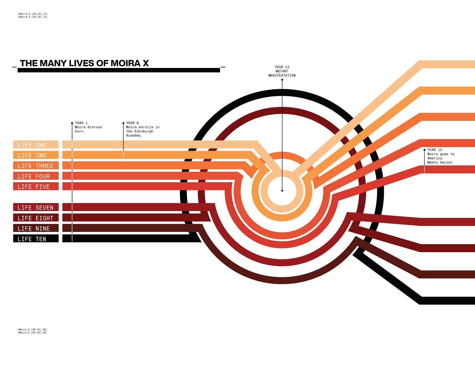
On the very first page of the game-changing new X-Men event series, House of X, the mystery behind Marvel's favorite mutants starts to unfold even before the first scene of the book.
A simple quote, from Professor X. "Humans of the planet Earth. While you slept, the world changed." Beside it, strange letters and numbers combine, "kra… [0.1], koa… [2.1]" almost like a computer running a program.
If the first few issues of House of X and Powers of X are any indicator, data pages like the ones seen halfway throughout the series play a major role in Jonathan Hickman's new X-Men story. In a very Hickman move, both new series come with charts, maps, infographics, and even full-text pages explaining vital parts of the story. Although it's been done before (including by Hickman himself in his acclaimed Avengers run), House and Powers of X's use of non-traditional comics storytelling techniques feel especially intriguing for a Big Two comic — the next evolution, perhaps?
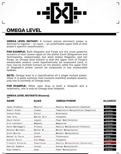
Hickman didn't design all the graphics himself, however, as the master comics scribe personally recruited designer Tom Muller to bring the House of X and Powers of X books — along with their various tie-ins — to life. In addition to Pepe Larraz and R.B. Silva's incredibly beautiful linework and Marte Gracia's colors, Muller's art direction can be seen throughout the story in the "data pages" and in each X-book's title logo. Other 'data pages' include information about Omega Level Mutants, a map of the new Mutant homeland of Krakoa, and even a list of high powered weapons obtained by the mysterious government organization Damage Control.
This week, Muller spoke to SYFY WIRE about the task of reimagining the X-Men, the thought process behind House of X and Powers of X and how design, down to creating new typefaces, plays into comic books. On Muller's Tumblr, he wrote of the collaboration "This is what comics can look like when you put two guys who like design systems in the same room."
Working in comics for close to 20 years, Muller got his start collaborating with comic artist Ashley Wood in 2000, eventually designing his Popbot and World War Robots book covers. Since then, he's worked with dozens of creatives including Mark Millar, Darren Aronofsky, Kent Williams, Iván Brandon, and Aleš Kot. During that time he's designed for DC Comics, Image, Valiant and Marvel as well as major corporations like Google, Paramount Pictures, Wired, Disney, Sony, and Hearst.
According to Muller, his first few conversations with Hickman were brief but informative.
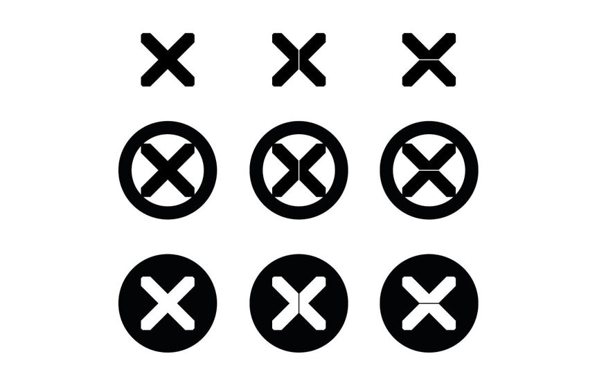
"The first thing Jonathan told me was 'I need a big X,' Muller recalls. "That was basically my brief, from which everything sprang. My contribution to the data pages was to help set the visual tone of voice, fonts, and develop the graphic treatment and design assets used to build these data pages, and going forward — design the treatment for the collected editions of the new X books."
Muller says Hickman reached out and asked if he was available and interested to work with him on the X-Men line revamp, "and that was that."
"With Jonathan masterminding the relaunch and the overall direction, he has very specific ideas of where the books need to go, and so we worked closely together to establish the graphic look of the story; with me delivering a design toolkit of parts: page templates, graphic elements, treatments for titles, text, data tables, etc; that Jonathan could then use to tell the story and the back matter that's placed throughout the comics," Muller says.
When they first started talking out ideas for House and Powers of X, the main thing Muller and Hickman agreed on from the start was that it should look and feel different from what had come before; and above all — modern, while keeping that connection to the history and heritage of the franchise.
"Whenever you do these kinds of projects it's about newness — bringing a new viewpoint to the table — that makes the franchise relevant again for a modern audience; and push it forward," Muller says.
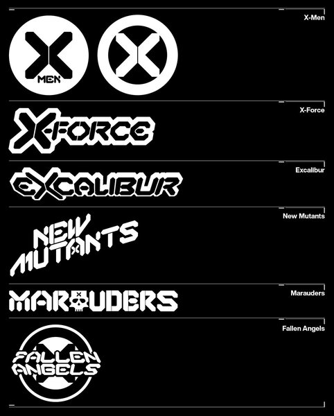
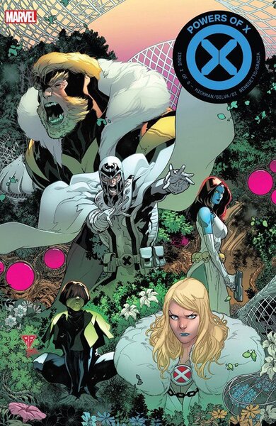
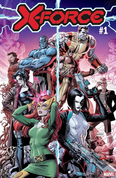
First on Muller's agenda was designing the new logos for the House of X and Powers of X series. Following that, Muller then designed the rounded trade dress that showcases the new X for both series. For those, Hickman required a newly redesigned 'X' mark and the rounded trade dress for the series. Additionally, Muller was in charge of the new logos for the Phase 1 series that flowed out of that design, which have been announced as classics X-Men, X-Force, Excalibur, New Mutants as well as new books Marauders and Fallen Angels.
"Once we had landed on the main "X" for HoX and PoX, I built out a full typeface around the X, including multiple variant glyphs for certain characters so I could create individual logos for each series that were unique, yet from the same family, but with differences between them," Muller said. "In that sense, I created multiple options for each title, each with subtle tweaks (a custom 'E' here, a different 'N' there, etc)."
When approaching comic book design, Muller says the main goal is always to design something that fits with the story and the theme of the series.
"This goes for all my work in comics, not just my work for Marvel," he says. "I always try to skew away from what you'd call a typical comic book design aesthetic that keeps repeating the same expected design tropes. Instead, I want to inject everything I do with a sense of modernity. The drive behind the relaunch of the X-Men line lends itself perfectly to that."
With this project in particular, Muller says honoring the history of the franchise is key because it's something everyone knows.
"The other thing I really wanted to achieve here is to create a uniform treatment so that when you see all the X titles on the shelf you can immediately recognize the connection between them," he explains.
Muller also went as far as color-coding the House of X and Powers of X each week, with Hickman providing a clear reading order for the series.
"The design was done by Jonathan and myself. I designed a set of templates and graphic elements, defined the typefaces we use, etc," he says. "Jonathan designed the abstract typeface you see in the issue and put together all the pages using the assets I created. The end result is a blend of both of us."
When they first discussed the approach for the data pages, Muller says Hickman wanted to keep them black and white to make then clearly contrast against the art pages;
"From there those designs evolved to include one accent color that helps to focus readers' attention on content that needs highlighting," he said.
This week, as Powers of X #2 drops, Muller says the project has been nothing but fun for him.
"It's been a great project to work on, helping to breathe new life into a much-loved franchise; and using design as a tool to tell stories," he says. "I think first and foremost, it's the opportunity to contribute creatively to an iconic pop culture franchise and a collection of stories that has been running since the '60s — and the chance, as I said earlier, to put your own stamp on it; by way of (re)shaping how readers experience these books. Some will be lifelong fans; for others, this might be their first X-Men comic."
Hickman's use of these types of data pages dates back to his work in creator-owned comics but a version of it can be seen in the pages of his 2013 Avengers run, where he, again, created an alphabet for the ancient Builders of the Marvel Universe.
"Jonathan has been using design as a storytelling tool to great effect since forever on his creator-owned books, and he's bringing this now to a 'Big Two' book," Muller says. "Similarly, I've been using graphic design as a storytelling device in series like VS and Motor Crush, where graphics and design bleed into the guts of the story, rather than only being used on covers and packaging. I think it's a very powerful tool that enables you to pull in the reader from the moment they look at the cover until they close the book."
![Chimera chart detailing Rasputin's mutant powers from Powers of X #1 [Credit: Marvel]](/sites/syfy/files/styles/scale_600/public/chimera.jpg)
![A map of the mutant island of Krakoa from House of X #1 [Credit: Marvel]](/sites/syfy/files/styles/scale_600/public/krakoa.jpg)
