Create a free profile to get unlimited access to exclusive videos, sweepstakes, and more!
No, That’s Not a Hubble Photo of “Cosmic Ice Sculptures”
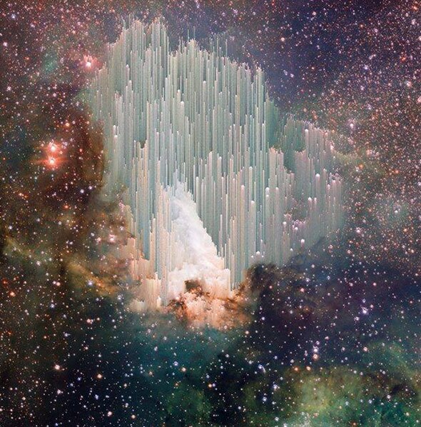
The funny thing about debunking artwork mistaken for science: There’s always more.
The image at the top of this article appears in my Facebook timeline every week or two; It’s clearly an astronomical photograph, but what is it? The captions accompanying the post vary, but generally say something like, “Via Hubble: The cosmic "ice sculptures" of the Carina Nebula. Scientists are still trying to explain the beautiful spires.”
This may shock you, but that’s wrong. And I mean, all of it.
First off, it’s not the Carina Nebula. It’s the Swan Nebula, also known as M17. I’ve written about it many times; it’s a star-forming gas cloud about 5,000 light-years away.
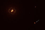
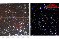
Second, it’s not a Hubble photo. It’s actually from the VLT Survey Telescope:
I cropped and rotated the image to more-or-less match the viral version. As you can see, this is the original version.
Which brings up the other claim: Scientists aren’t puzzled over the spires. We know exactly what they are: an outcome of an imaging manipulation technique called pixel sorting.
Digital images are really just a two-dimensional representation of a table of numbers, where the numbers represent the brightness and color of each pixel in the image. The table is arranged in rows and columns that map to the rows and columns of the picture.
The numbers can be manipulated mathematically to produce different results. You can do something as simple as average adjacent numbers together to blur the image, or you can apply incredibly sophisticated algorithms that can sharpen an image and bring out details.
Pixel sorting does pretty much what the name says: It sorts the pixels in a column or row, usually by brightness (and sometimes with some sort of contrast or brightness threshold so that the underlying image can still be seen). When the image is displayed, you get long spikes that get dimmer in one direction—the result of the pixels being arranged by brightness. There are various versions of this online you can play with; this one is pretty straightforward.
In the Swan Nebula case, this was done most strongly in the center of the image, and it looks like some fiddling was done to smear the columns a bit.
So, to be clear, this image is not real. It was originally an actual astronomical image that was manipulated in a mathematical way to produce an interesting, even lovely, piece of art.
So who did this? Enter Reddit: Someone asked about this image on the community site, and it didn’t take long for a user to post the information. It turns out the manipulated image was done by an artist named Adam Ferriss, who has applied this technique to quite a few astronomical images. The results are pretty interesting, and I happen to like them, too.
I sent Ferriss a note about this, and he replied saying he never meant to fool anyone into thinking the image was real, of course (he also pointed out that Snopes covered this as well). It’s not surprising to me that people have made that mistake; having seen this happen literally hundreds of times over the years, I find it very clear that most people on Facebook and other social media really aren’t all that familiar with scientific images, even popular ones from Hubble or the Curiosity rover.
Oh, and the claim that this spires are “ice sculptures”? Weirdly, that seems to come from a NASA press release from 2010, describing a Hubble image of … the Carina Nebula! So that would explain the weird description, as well as mistaking the VLS image of the Swan for a Hubble image of Carina.
So there you go. Mystery solved. This isn’t the handiwork of God, or an unexplained scientific enigma. It’s science, and it’s art, and it’s pretty cool either way.
Tip o’ the color palette to Oana Sandu and to Hubble Space Telescope on Facebook.

