Create a free profile to get unlimited access to exclusive videos, sweepstakes, and more!
Plumes of Magellan
Every now and again, I see a picture of an astronomical object that has me scratching my head.
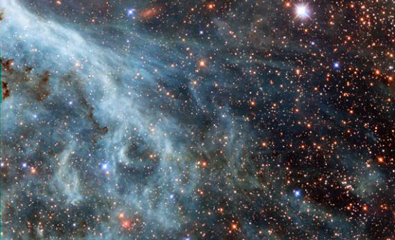
The image above is from Hubble Space Telescope, and shows a section of a nebula in the Large Magellanic Cloud, a dwarf galaxy companion of our Milky Way. Lovely, isn’t it? Delicate streamers wafting across a field of stars …
But what is it, exactly? I was thrown when I saw it. Usually, blue wisps like this are dust—microscopic grains of silicates or long carbon-based molecules. Dust is very good at scattering blue light, in the same way our atmosphere scatters blue light from the Sun, making the sky blue.
But that didn’t make sense to me. Dust scatters blue, so stars behind the dust look red: The blue light from them is scattered away, and we don’t see it. But the stars behind this material don’t look any redder than the other stars in the frame.
That’s when I checked the filters used for the image. Aha! Normally, images like this use a filter that lets through light emitted by warm hydrogen, called H-alpha filter. This strongly emphasizes gas in the image.
In this case though, the filters chosen were different. What you see as red is actually from the infrared. What you see as green is actually coming from a filter that lets through orange light; what’s displayed in the picture as blue is actually a mix of blue-violet and ultraviolet light.
So those wisps are gas, not dust—in fact, this is showing the outskirts of the Tarantula Nebula, a vast star-forming gas cloud in the LMC, with which I’m fairly familiar. The color threw me off!
Elemental gas—say, hydrogen—emits a variety of colors. The strongest in visible light is in the red, that H-alpha I mentioned earlier. But it also gives off blue and green. Oxygen is very strong in the green, but also emits some blue. So the gases we’re seeing in this image are the usual ones in nebulae, but displayed differently.
It’s a little disconcerting to see that; I’m used to colors being displayed a certain way in images like this. But sometimes mixing things up can help. Structures you might miss pop out, for example. Also, some regions of nebulae are at different temperatures, which means oxygen or helium might dominate the emission over hydrogen. Changing the colors can make this easier to spot.
So while at first this image knocked me off my game, as I looked at it more I got to appreciate what it was showing me. It’s easy to get too comfortable doing things the same way all the time. Sometimes it helps to shake things up a bit.

