Create a free profile to get unlimited access to exclusive videos, sweepstakes, and more!
The look of a Titanic moon
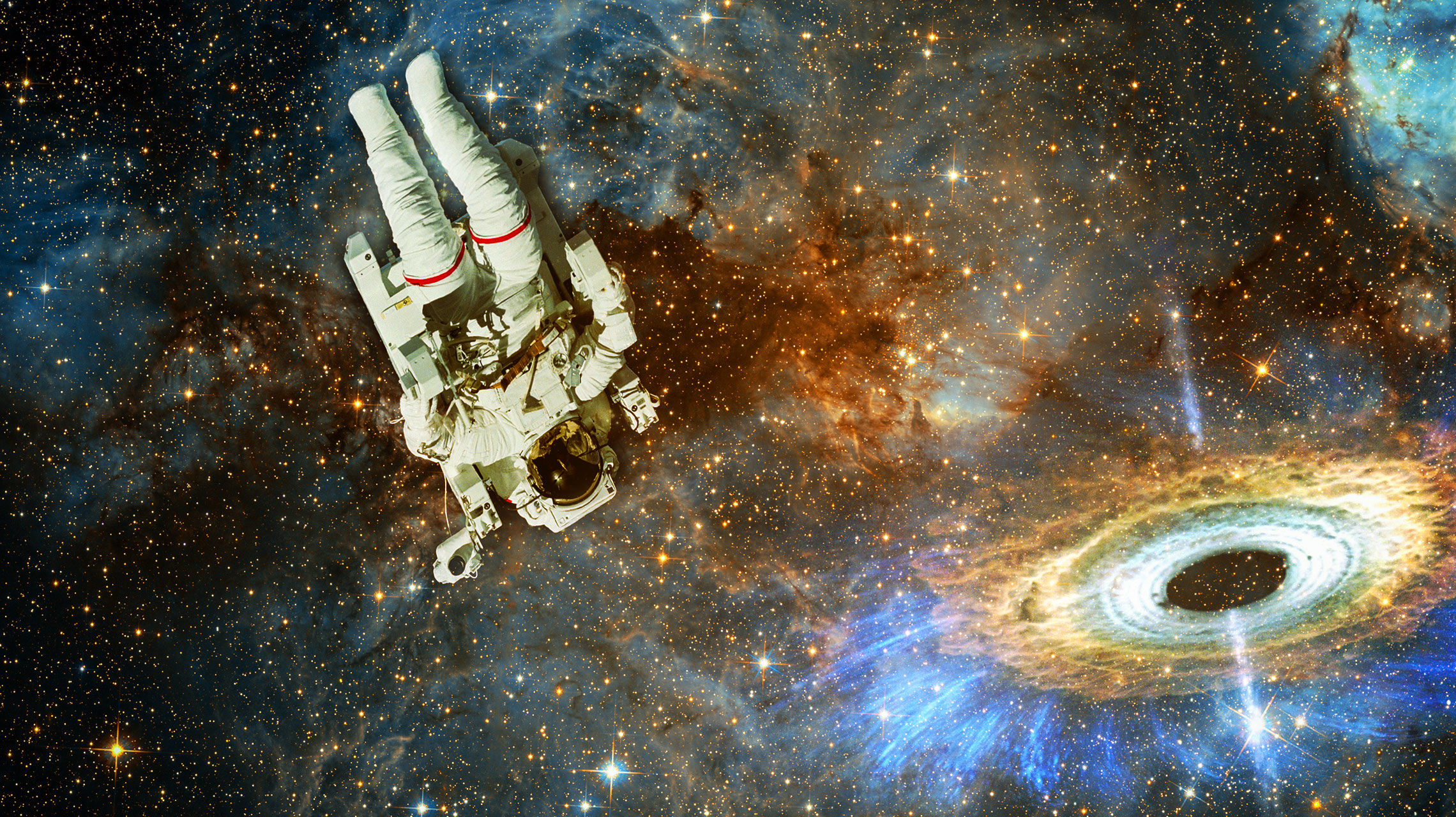
Astronomical imaging is an interesting process. The most common question I get when I show a picture is, "Is this what it would look like if you were actually there?"
That's a tough question to answer in many cases, because our eyes see in a different way than cameras take pictures. We have receptors in our eyes that are sensitive to red, green, or blue light, and they send signals to the brain which then constructs a "true color" image from that. In astronomy, we use filters to mimic that, but they don't actually perfectly represent the way our eyes see. And even after you get the picture, there are adjustments in contrast, brightness, and so on that can alter a photo.
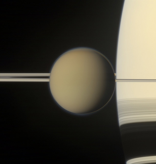
A few months ago, the folks at Cassini released a really cool picture of Saturn's moon Titan. It's a great shot, have no doubt, but amateur astrophotographer Gordon Ugarkovic -- who has some experience putting together color pictures from Cassini images -- felt that processing the image in a different way might represent natural color better. So he reprocessed it, producing this amazing image:
[Click to encronosenate.]
All by itself, that's a stunning shot. Titan is larger than Mercury, but still dwarfed by the gigantic planet it orbits. Titan has a thick atmosphere, and you can see some details in it, like the "polar hood" over its north pole. Also, a really neat effect is on Saturn itself. You can see the rings, as well as the shadow of the rings on Saturn's cloud tops (below the rings themselves). Near the edge of Saturn, the shadow dips downward, hooking down a bit. That's a product of several effects, including refraction; the bending of light as it passes through the atmosphere (similar to why a spoon looks bent in a glass of water).
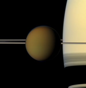 It's interesting to compare Gordon's version to the one released by Cassini as well (shown here; click to embiggen). Both are beautiful, interesting, and show a lot of detail. The "official" release is darker, a bit, which is the most obvious aspect. Gordon's shows details in Titan's polar hood better, but I see more subtle variations in Titan's atmosphere overall in the official shot, and perhaps better detail in the ring shadows, too.
So which one is better? Neither! They both are amazing, and show slightly different things. One might appeal to you more in an aesthetic sense, or in a scientific sense, or because you'd rather see details in Titan versus Saturn, or whatever. But in my opinion, it's OK to like both or neither or one over the other for whatever reason you prefer.
In astronomical imaging -- something I did professionally for over a decade -- the image is never really what you'd see if you were there, because the instant you use a camera and a telescope you're already two steps removed from real vision. You can try to get as close to what the human eye would see as you can, but I think in most cases that's a conceit, something that's interesting to our minds but perhaps not our eye.
And like all photography, this is art. If you want to display an astronomical object and are being true to what you are showing, then it's OK. These images done for press releases or simply for their own sake are meant to inspire our imagination, fire up our curiosity, and see their beauty.
Beauty that is, at the very least, in the mind's eye of the beholder.
