Create a free profile to get unlimited access to exclusive videos, sweepstakes, and more!
The median Earth

One of my nerdier traits is that I love maps. I always have; I used to pore over atlases as a kid, and kept myself busy in the back seat on long trips looking over the route we were taking and seeing what else was around us as the miles* flew by.
As a scientist I use maps all the time, of the sky and of the Earth (and sometimes other worlds, too). Since I started becoming interested in climate science, the debunking of denial thereof, satellite maps of the Earth have taken on a new importance to me as well. I've always been fascinated by that sort of thing anyway, but the clear and present danger of global warming can be seen so easily on satellite maps, especially ones that show change over time.
And sometimes there are global images of the Earth that are just interesting without necessarily having a lot of scientific content. Like this one:
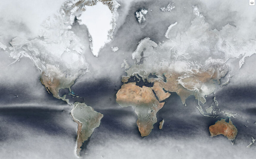
It's lovely, isn't it? In a sense, this is the average view of the Earth over the entire year of 2018… but only in a sense. The reality is a bit more complicated, and that means it's more interesting, too.
This image was created by Johannes Kroeger (who goes by the handle cartocalypse on Twitter) using images taken by the Visible Infrared Imaging Radiometer Suite (or VIIRS) on board NASA's wonderful Suomi NPP Earth-observing satellite. VIIRS is a detector that can see in visible light as well as infrared, and observes the Earth constantly monitoring the oceans, land, and atmosphere. It can observe fires, city growth, sea surface temperature, and much more; it's a critical component of our measuring the impacts of climate change.
Of course, the Earth is constantly changing, especially cloud cover. VIIRS creates a daily global mosaic, a map of the entire planet in each filter. Kroeger grabbed all these maps for a year in the red, green, and blue filters (so he had 365 maps in each color).
There are lots of options Kroeger had in putting them together to create a single map. Adding them all together to get a weird, smeary version of the Earth would probably not be terribly interesting (as weather changes — clouds, hurricanes, and the like — it blurs out the ground beneath it, making a mess). Or he could take the actual mathematical average, but that tends to heavily weight wild fluctuations.
Instead, he took the median. This is clever; it gives a better feel for what's really going on than average. In a set of values, the median is the number where half the values are greater and half less than it. In other words, it's generally close to the midpoint value of the set.
An example: Say you have five people. Four of them have a dollar, and one of them has 96 dollars. The average amount of money they have is the total money divided by the number of people: $100 / 5 = $20. That's not very helpful; it makes it seem like most people have more money than they do.
But the median is the number in the middle. In this case that number is $1! The set is [1,1,1,1,96], and so by definition the median is 1. This is an odd example, I know, but the point is that when you take the median, wild extremes are thrown out, making the value better for many applications.
In the case of the map, for each pixel (each spot on Earth) in a given filter, he took the median brightness value for that pixel. That gave the median value for every place on Earth in the three filters. Then he added them together to create a more-or-less natural color map of the planet.
It's not a bad way to show how cloudy a particular spot is over the year. If you see lots of clouds in this map, that means it's a pretty cloudy place more than half the time. If it's clear, it means that spot has clear skies more often than not.
I'll note you have to be careful: Ice and clouds look the same — white — in the map. Sometimes it may seem obvious, like say over Greenland. But even then, while you know Greenland is covered in ice and snow, it might also be cloudy there a lot. This map doesn't help much there.
But if you look near my neck of the planet, in the Rocky Mountains of Colorado, you'll see it's white. That's snow; it's actually sunny here more than 300 days a year.
It's a bit easier to interpret over the oceans, like that long line going east to west near the equator in the Pacific. That's the Intertropical Convergence Zone — what used to be called the doldrums — where the northeast and southeast trade winds meet. This creates a lot of clouds, mainly due to thunderstorms, and that's so common it shows up clearly in this map.
You can also see clouds off the southwestern coast of the Big Island of Hawaii, and that tells you what direction the wind blows there. Or you can look in the Caribbean and see the gorgeous turquoise water there; the color is very pretty and also tells you it tends to be sunny there. You can spot other features if you poke around; there's a nice interactive version of it you can play with, too.
I wonder if something like this, built up over many years, could help astronomers plan places to build observatories? I suspect local weather stations can do this more accurately for some locations, but it might also be helpful to get an overview. What else can something like this do?
Scientifically, it's not clear to me. But then, you never know. As I've said here so many times, when you play with data and create new tools to look at it, you can stumble across connections you might not otherwise see. So while Kroeger may have created a beautiful map by playing around, he's also shown us something useful. I'll note NASA does similar stuff with satellite data, too.
Science is all about observing, hypothesizing, measuring, and making conclusions. But the part of that they don't tell you is in there? Playing around. That's important sometimes, too.
*When I was younger I didn't use metric, so saying "kilometers" here sounds funny. Plus, due to my own predilections, the metric system sounds more sciencey and less poetic here, so "miles" is a better choice. I've dealt with this problem before, too.