Create a free profile to get unlimited access to exclusive videos, sweepstakes, and more!
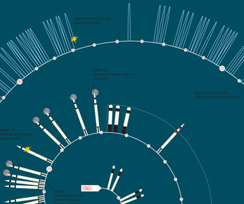
US manned spaceflight infographic

I'm a fan of simple infographics: illustrations that make a point clearly and cleanly. The folks at mgmt. design have made one for US manned spaceflight that does just that.
Click that to enboosternate it; I've put just a portion of it here. I like it because you can see a few things instantly, for example how short the Apollo program was compared to the total amount of time we've been space traveling.
Even more obvious are the gaps in flights. The biggest is post-Apollo and pre-Shuttle, when the Saturn V was essentially decommissioned before the Shuttle was anywhere near being ready. That might be something to keep in mind during the current gap in the US capability to put humans in space.
Also obvious are the pauses after Challenger and Columbia, when the safety of the Shuttle was reassessed. Now, of course, we're in the second long gap.
I wonder how long it will last? And perhaps more importantly, just how it will end?


