Create a free profile to get unlimited access to exclusive videos, sweepstakes, and more!
Gaia: This is not a photo of the night sky

Last week, I wrote an article about an all-sky map made by the wonderful Gaia mission, which has charted the positions, velocities, and colors of a staggering 1.7 billion stars. It sweeps across the sky taking extremely careful measurements of all these stellar characteristics, yielding a vast amount of data — and delight — that astronomers will enjoy for years to come*.
The main thrust of my article was about a map of stars that revealed the Sun's motion around the Milky Way. At the top of the article I put in a color map of the sky made from Gaia data, but rather blithely slid past it to get to the main point about solar motion.
But I want to say more about that image. It's amazing, and beautiful… but it's not a photograph! At least, not really.
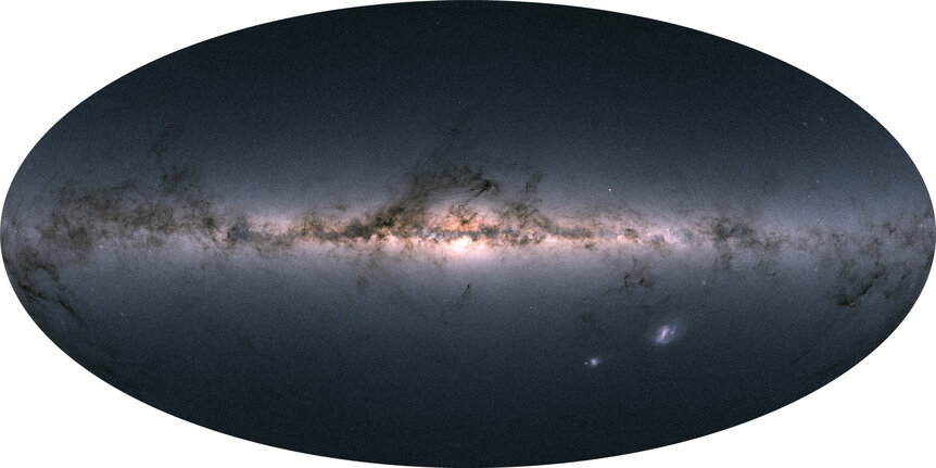
The detail on it is stunning. You can see zillions of stars, streamers of dust, and even the Small and Large Magellanic Clouds (two dwarf galaxy companion satellites of the Milky Way).
… or do you?
When I say this isn't a photo, I mean it's not composed of static images stitched together into a mosaic of the sky. Instead, it's a stellar density map: literally a map of star counts in the sky. Every pixel represents a position on the sky, and the brightness of the pixel is determined by the number of stars covered by that pixel! This is different than a photo that maps brightness itself. For example, in a standard photo you'll see bright stars dominating, stars like Sirius, Canopus, and Betelgeuse, which are among the brightest in the sky. But in this map they count just as any other star.
Since Gaia gets color info for every star as well, the average color in a pixel can be determined and displayed as well. You see redder stars toward the galactic center (in the center of the image), because the stars there are older and redder, and also because the dust in that direction lets red light through better than blue.
The dust streamers in the map do look very much like they do in photos, because what you're seeing is where the dust blocks light from stars behind it, so you see fewer stars.
What I also like about this is that you can see what look like individual stars scattered around the image (most notably the one just above the galactic plane to the right of center). If this were a photo I'd say those were just bright stars. But it's not, and they aren't!
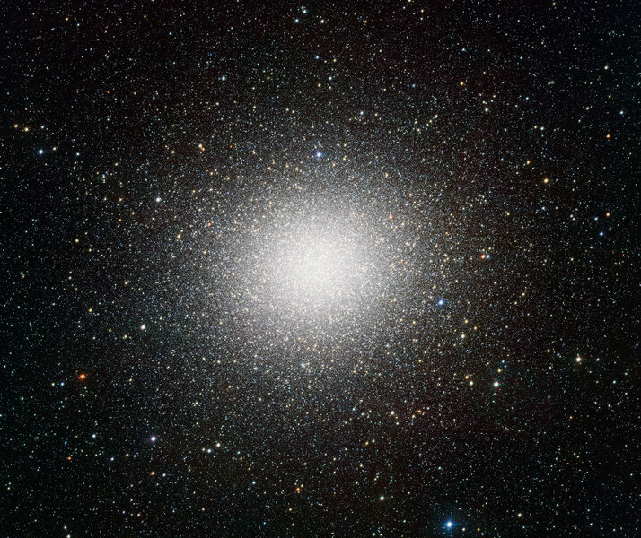
They're globular clusters, where hundreds of thousands or even million of stars live, bound together by their mutual gravity. The bright one I pointed out is Omega Centauri, one of the two biggest and brightest globulars in the sky. It's visible to the naked eye (if you're far enough south and have decent skies), but it's hardly as bright as even a run-of-the-mill star. But it appears bright in this map because Gaia can resolve many of its stars. Remember, this is a density map, so where there are lots of stars you see brighter pixels! So that blip is actually a whole pile of stars in one small spot. Using a planetarium app (I like Sky Safari, but there are lots out there), I was able ID a bunch of globulars in this map.
It's possible, I suppose, to argue that I'm splitting hairs a bit here, since this does look so much like a photo. When mapping the dust and big objects like that on a large scale, the difference may be small… but when it comes to individual stars you won't see them on this map, but what do look like individual stars aren't. So this really is a different way to see the sky.
And that's part of the point. We use telescopes, we launch them into space, to see the Universe differently than we can by eye. Every time we do — heck, every time we take a simple photo as well — we're observing the sky in a way different than our eyes do. This always teaches us something new.
And, of course, that's why we do it.
*I like to picture astronomers diving into the data like Scrooge McDuck into his vault full of gold coins, but then I remember that doing that would kill you. I'm not sure it would kill a duck (they're much smaller and lower density, which I don't think was taken into account), but at this point I think I've wandered off the path a bit. Go back to reading about the galaxy.