Create a free profile to get unlimited access to exclusive videos, sweepstakes, and more!
How Stephen King's books inspired the 'Stranger Things' opening titles
Hawkins, Indiana needed the perfect '80s-inspired opening — and Imaginary Forces answered the call.

(EDITOR'S NOTE: A version of this interview first appeared on the SYFY WIRE website in 2017 around the premiere of Stranger Things' second season.)
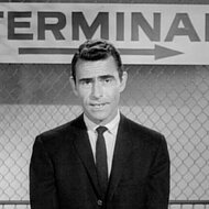
A moving map of Westeros. The skeletal fingers of an android fluttering across a piano's keyboard. Elements of the periodic table set against a green and smoky background. While not something viewers often pay much attention to, the opening credits of a television show can be works of art in their own right. No doubt, you knew we were talking about the introductory sequences for Game of Thrones, Westworld, and Breaking Bad just from short descriptors mentioned above. Title sequences have the ability to set the tone for what we’re about to watch — regardless of genre.
Take, for instance, Stranger Things, which goes to painstaking lengths to evoke the atmosphere and culture of the 1980s. And yes, that philosophy applies to the inaugural credits, whose design began with a fortuitous phone call from series creators, Ross and Matt Duffer, to Imaginary Forces (a studio known for its work on shows and films like Castle Rock, Jessica Jones, and Spider-Man: No Way Home).
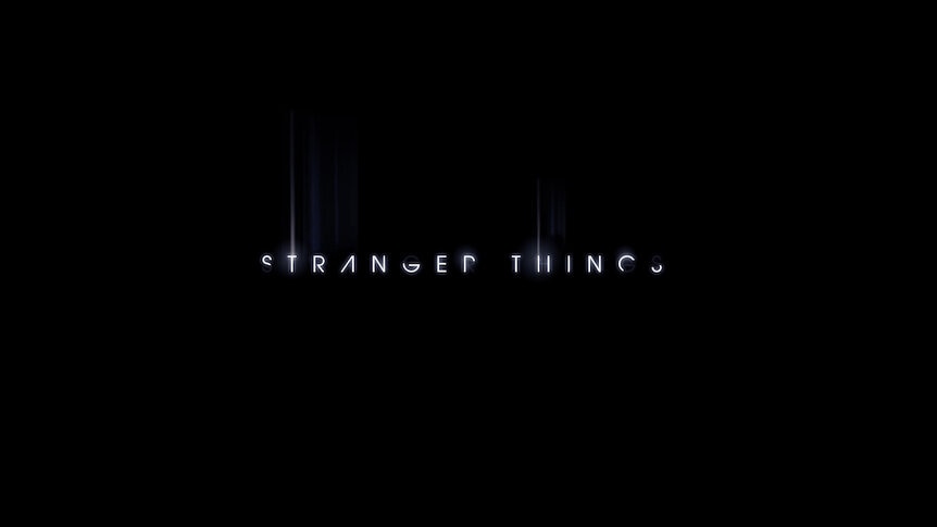
"They gave us their vision of what they wanted this sequence to be and they referenced Richard Greenberg right off the bat," Creative Director Michelle Dougherty tells SYFY WIRE over the phone. "Richard was a title designer from the ‘70s, 80s, and into the ‘90s. He was one of those designers that used typography to really kind of set this mood and tone. He did Altered States and Aliens."
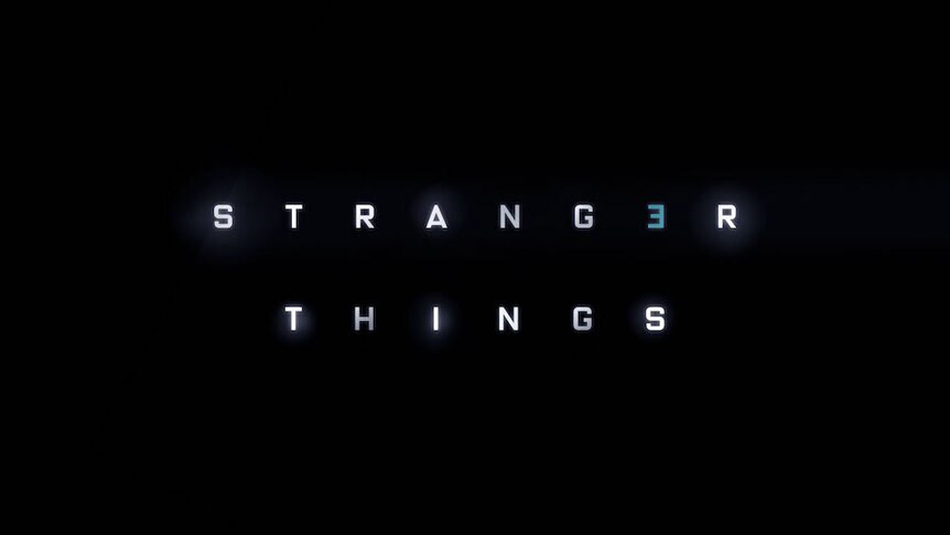
While the initial title treatment designs (which you can check out below) did channel the work of Mr. Greenberg, they ultimately felt a little too "modern," which prompted the Duffer Brothers to provide reference material in the form of old Stephen King paperbacks like these.
"When you look at those covers, there’s definitely a kind of ‘80s vibe to them because I think typography in that time was kind of chunky and big," Dougherty explains. "So we look at that and we’re like, ‘Ok, now we understand. [They] really wanna push this towards the ‘80s.’"
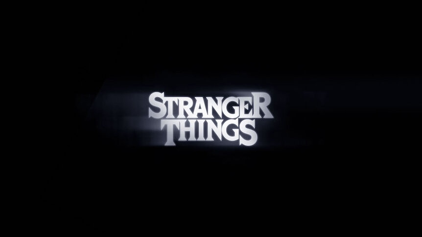
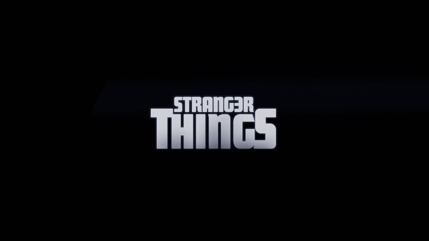
The final font (also pictured below) is a variation of a typeface designed by Ed Benguiat, who passed away in the fall of 2020.
"I read somewhere that he was influenced by Art Nouveau, Dougherty continues. "And then a young designer, Jacob Boghosian, he took that typeface and he altered it a little bit by putting together the type, so if you look at some of the letters, they look like they’re hugging ... Then we took his type and we altered it more by creating the outlines and the lines of the top and the bottom and making the ’S’ bigger, the ‘R’ bigger. It’s kind of like many hands to make this bigger thing."
A loving nod to the iconic horror and comic-of-age tales spun by the likes of King, Spielberg, and Joe Dante, Stranger Things drops the viewer into Hawkins, Indiana, circa November 1983. It's an all-American town whose sleepy existence is rocked a local government installation, which is up to all sorts of shady hijinks, creating telekinetic children and ripping holes into other dimensions filled with bloodthirsty monsters. When young Will Byers (Noah Schnapp) is snatched by an inter-dimensional beast — dubbed a "Demogoron" by Will's D&D buddies — the citizens of Hawkins find themselves picking up the check of a sinister conspiracy.
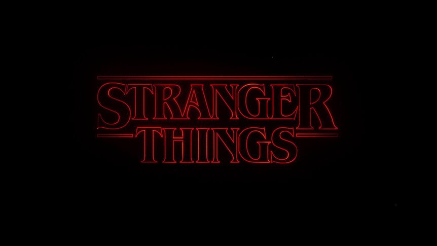
To reflect the nostalgic period setting and genre elements of the story, Dougherty and her team "came up with some different designs and we really liked this idea of having red against black," Dougherty says. "Because when we’re coming up with a main title, we always try to define the emotion we’re aiming for, right? And I knew that this was mystery and drama and so, it’s suspenseful. Red helps make your heart palpitate, so we thought that that was a good direction [to go in]."
She continues: "We created a whole board using this outline typography and the idea of them coming together. Originally, I think our letters were much smaller, almost like little pieces of a chess game that you saw right away, but as we evolved the sequence, we focused on the big pieces of the type, so you didn’t really know it was a typeface yet. You just felt like it was these forms coming together, but again, using that same idea of pieces of a puzzle or pieces coming together."
Much like the hairstyles and fashions of the Reagan era, the typefaces of that particular decade "were quite big and clunky," Dougherty says. Look up any cheap paperback novel published during that time and you'll see what she's talking about. In fact, Grady Hendrix has a great book exploring the provocative cover art of horror-focused books published throughout the 1970s and '80s.
"You don’t see that very often now. To me, that really says ‘80s," Dougherty adds. "It’s almost like some of them were garish-looking ... But that was the style of the ‘80s and then, of course, everything else comes with it. The thing you see on the book and then you see the paper and you’re like, ‘Wow, I haven’t read a book on paper for a while' and then you start imaging what the smell of the paper [is] like and you remember where you were sitting when you read that book. So it's all those things."
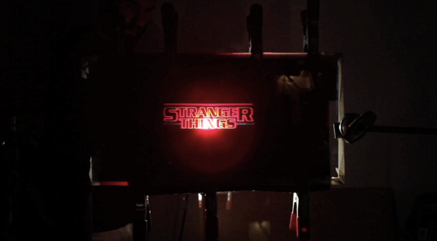
With the font and color scheme decided upon, Imaginary Forces began to run tests on how the letters could lock together and again found the results to be a little too modern. That's when Dougherty pitched the idea of emulating the aesthetic of film opticals, a pre-digital process in which a stream of text (be it on a piece of paper or another screen) was recorded by a traditional film camera. The famous opening crawl for the original Star Wars movie is a great example of this antiquated technique. As fate would have it, Star Wars title designer Dan Perri was brought in as a consultant for Stranger Things.
"He was in our office one day and we were showing him and kind of picking his brain and he was laughing. He was saying ‘Why do you want to film it out? Just do it digitally!’ So we picked his brain about what little inconsistencies we could do to it to make it feel real," Dougherty recalls.
By the 1980s, optical methodology "had been perfected, or or as much as it could be," but the creative director liked the idea of the Stranger Things credits — which were still brought to life digitally — feeling as though they'd been done by a cheap optical house on a shoestring budget. To that end, they "experimented with passing light through physical Kodaliths," according to the Imaginary Forces website. It's all pretty technical stuff, but as explained by the National Portrait Gallery, a Kodalith is "a type of photographic printing paper coated with an orthochromatic emulsion which gives a high contrast print with very dense blacks." (see below for what it looked like)
"I really wanted you to feel like you were watching a piece of film," Dougherty concludes. "It gives you that extra sense like a sense of touch. Your eyes basically wanna touch it."
The first three seasons of Stranger Things are now streaming on Netflix. Season 4 is slated to premiere summer 2022.
Click here for the full list of individuals who worked on the show's opening titles.